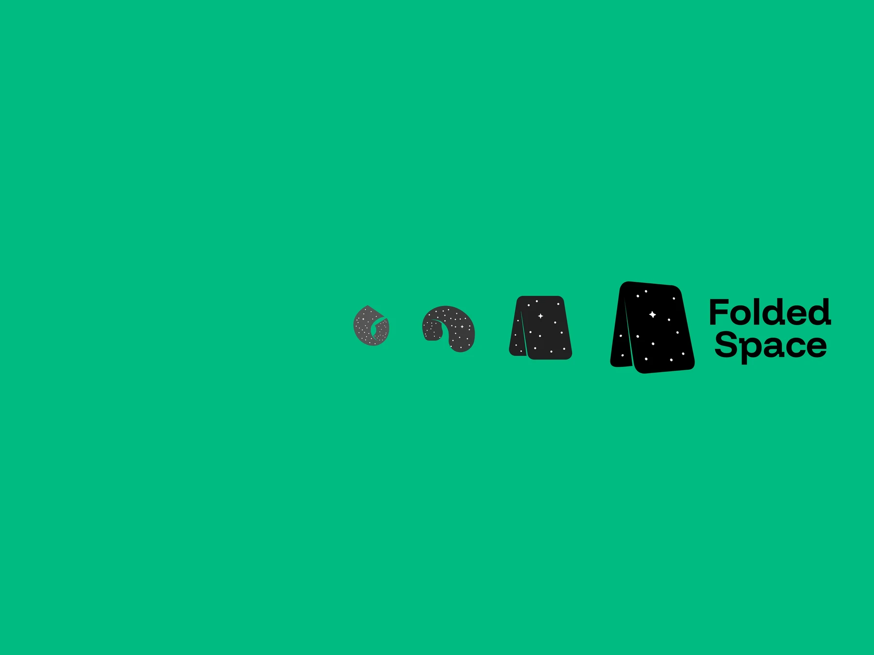
Creating a visual identity for a creative business built around finding better ways to work.
Folded Space is my own creative business, specialising in video, motion graphics, design and creative training. Developing its identity gave me an unusual opportunity: rather than designing a brand for someone else, I could use the process to explore exactly what I wanted the business to represent.
The name came from a simple idea. I tend to work slightly differently from the conventional path. I might use Apple Motion instead of After Effects, Affinity instead of Photoshop, or find a completely different approach to solving a problem. I'm interested in using the right tool for the job rather than automatically reaching for the industry standard.
That led me to the idea of finding the shortest path. You’ve probably heard the cliché that the shortest distance between two points is a straight line. That’s true — but in theoretical physics and, perhaps more recognisably, science fiction — there is the idea of folding space so that two distant points can come together. This makes the distance between the two points effectively 0.
That became the thinking behind Folded Space: finding more efficient ways to get from A to B, removing unnecessary bottlenecks and using creativity and technology to find a better route.
Designing the mark
I wanted the logo to capture that idea without explaining it literally.
The early exploration went in several directions, including stars, typography and increasingly abstract interpretations of the name. I considered a more rounded, illustrative form – almost like a plane folding over itself – but it quickly became clear that it was too complex.
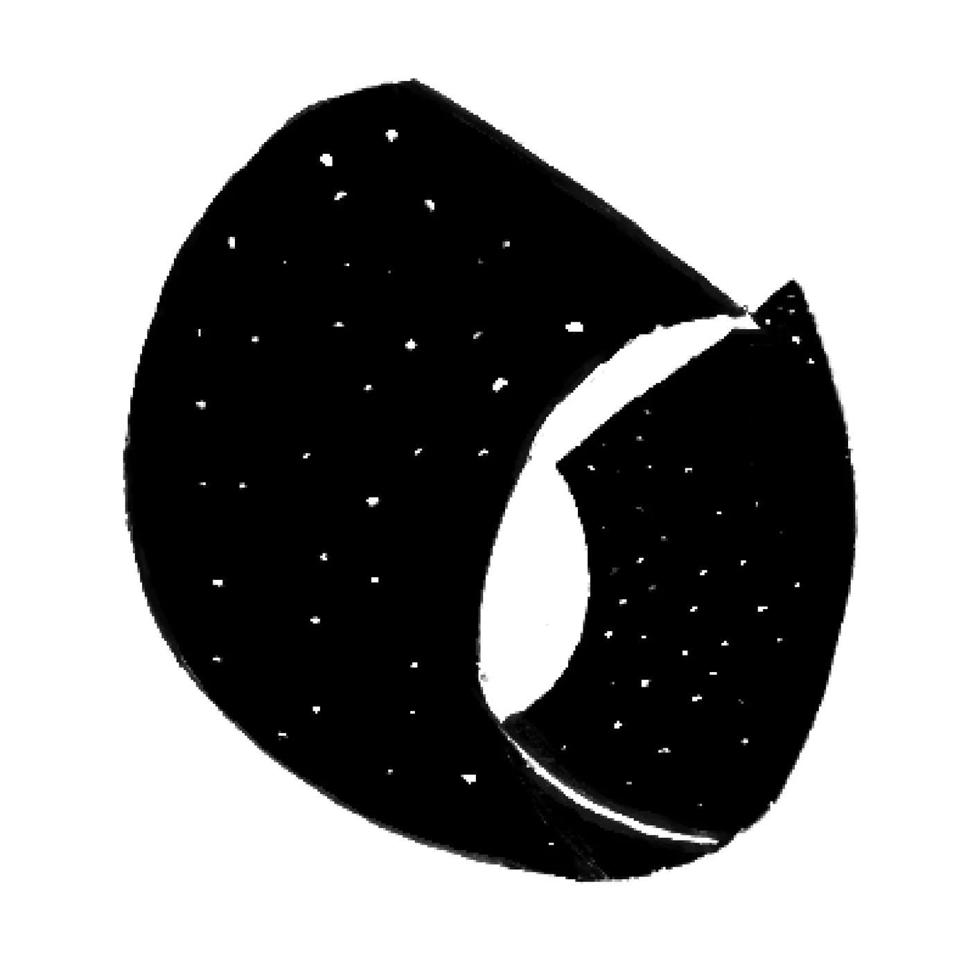
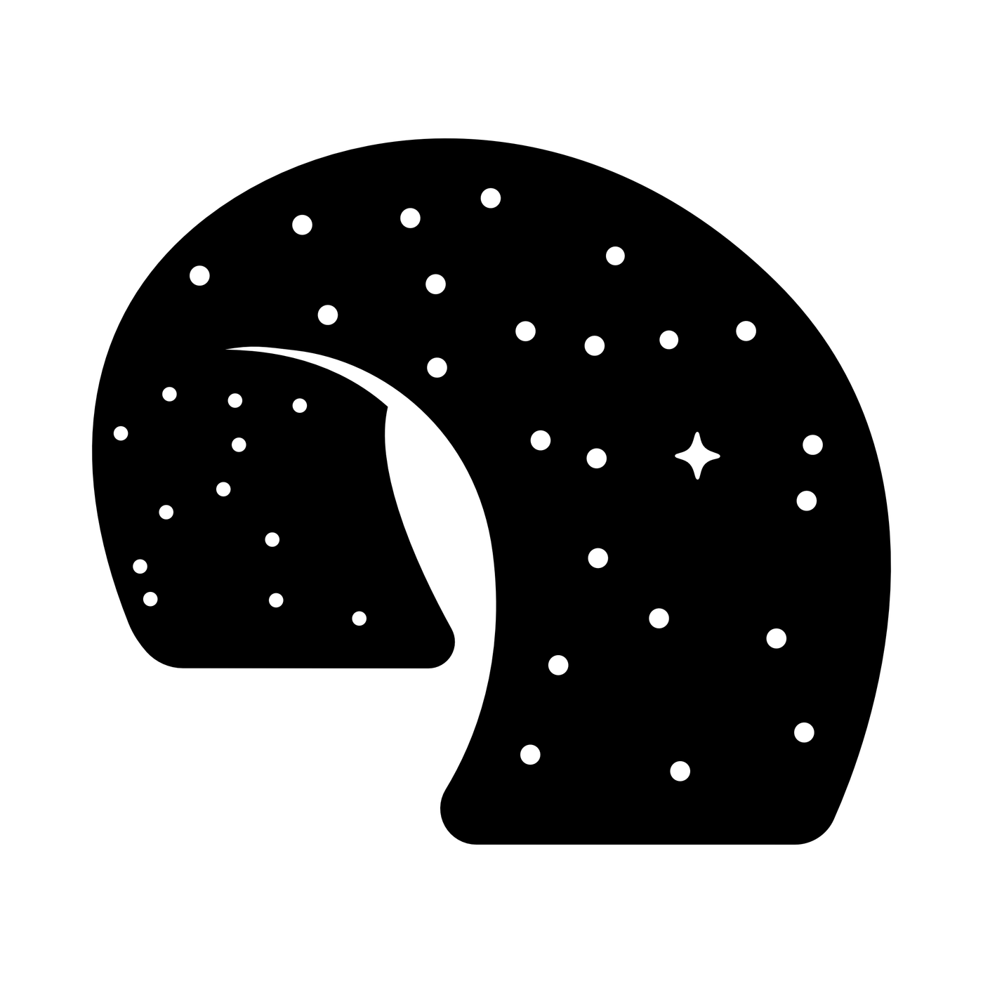
I was looking for something simple and memorable, but with the illustrative character of contemporary designers I admire. The result was a deliberately simple geometric mark built around the idea of folded planes.
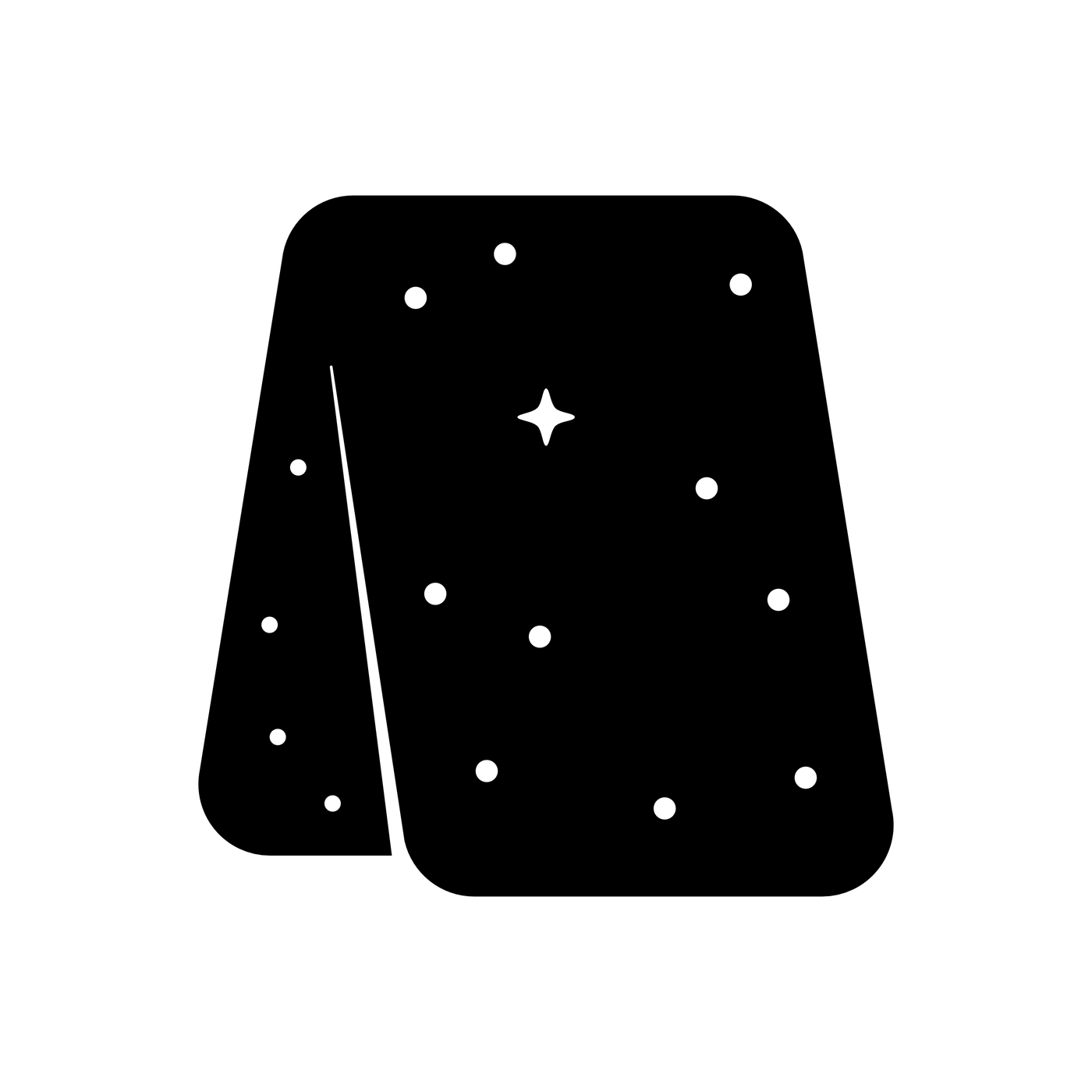
It doesn't immediately explain itself, which I think is good. Folded Space isn't a name that tells you exactly what the business does. I wanted the mark to be intriguing — something that might make someone stop and wonder how it works or what it represents.
When the logo had to move
The biggest change to the identity came when I started animating it.
My original logo was designed to suggest a three-dimensional object, but it wasn't actually constructed as one. Its perspective was closer to an isometric illustration, which made it visually convincing as a flat graphic, but not geometrically consistent when viewed from a different angle.
My original idea for the animation was to have the logo fold backwards, almost like a wallet, with the different faces rotating in relation to one another until the rear face became the front.
Very quickly, I discovered that the geometry simply didn't work. I had the option to animate the original construction using a more traditional hand-drawn approach, but that felt like the wrong solution. There is something deliberately geometric about Folded Space, and I wanted the animation to feel connected to ideas of space, perspective and the diagrams used to visualise scientific concepts.
So rather than forcing the original logo to do something it wasn't designed to do, I rebuilt it.
Rebuilding the logo in 3D
I reconstructed the mark as a genuine three-dimensional object, with consistent perspective and geometry. That solved the animation problem, but it also changed the identity itself.
The 3D version had a sense of depth and dimensionality that the original couldn't achieve. Carefully controlled lighting and shadows helped separate the front and rear planes and made the geometry much easier to understand.
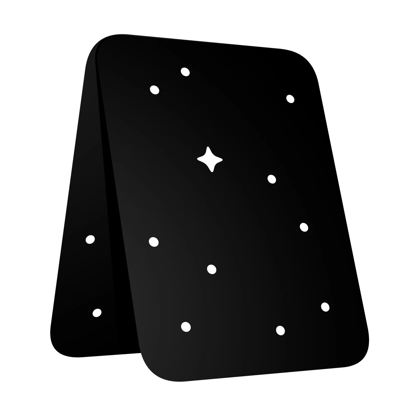
The animation could now behave like an actual object rather than an illustration pretending to be one.
Interestingly, the animation also fed back into the logo design itself. The logo came first, but the process of animating it revealed things that could be improved. The identity therefore evolved alongside the motion rather than treating animation as something simply added at the end.
Two versions of the same identity
The 3D treatment wasn't intended to replace the original flat mark completely.
The lighting and shadows that make the dimensional version work so well aren't appropriate for every application. A logo used on a document, printed in one colour or reproduced at a very small size needs to be much simpler, so I reverse-engineered a new flat version from the completed 3D geometry. The result is a more consistent 2D interpretation of the mark that retains the perspective of the 3D model without relying on lighting, shading or simulated depth.
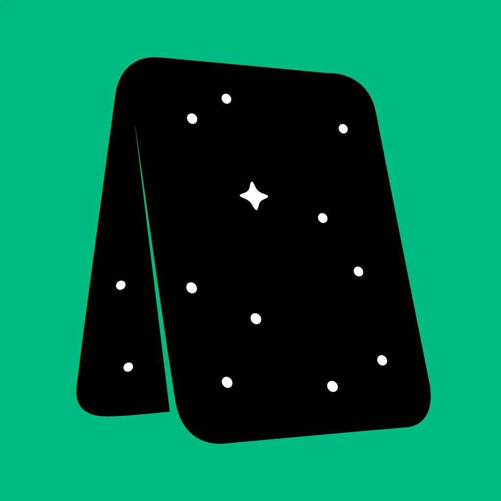
The two versions therefore aren't competing logos. They're different expressions of the same underlying geometry.
The dimensional version gives the identity depth and personality when the medium allows it. The flat version provides the clarity and simplicity needed for more practical applications.
A brand designed for motion
Motion is particularly important to Folded Space because it is fundamental to the work I do.
The identity therefore isn't just a static logo that happens to have an animation. The relationship between the mark and motion actually became part of the design process itself. The 3D construction gives me a consistent foundation for animation, while the simpler version gives the brand a clean graphic expression when motion and dimensionality aren't appropriate.
The identity is now being used across the Folded Space website, email signature, social media and other digital applications, with the same visual language extending into my video and motion work.
From personal brand to creative business
There was another reason this identity mattered to me. Previous versions of my business identity had largely been built around me personally. I had effectively tried to turn myself into the brand.
That no longer felt right.
As Folded Space became a more serious business, I wanted to remain the face of it without making myself the entire identity. That distinction matters.
Folded Space gives the business its own character and a visual identity that can exist independently of me, while still allowing me to be the person clients see, work with and ultimately associate with the company.
The result is a brand that reflects how I want to work: creative without being frivolous, technically minded without being cold, and deliberately willing to take a different route when there's a better one available.
It feels apt that the identity itself ended up taking a slightly different route from the one I originally planned.